by creativecoeur | Mar 29, 2020 | Public Service
Social reaction to the virus has, in many cases been worse than the virus. This bug, as bad as it is, shouldn’t be threatening the fabric of life as we know it.
Certainly we should have been better prepared, but even so, the apocalyptic reaction by the public and our government officials (not a partisan statement – observation) has led people to hysteria and panic. This is generating a ripple effect, worsening the virus’s impact on our overall health, economy, and society as a whole. It is likely that we’ll suffer more from the unforeseen consequences of our collective fear than from the virus itself.
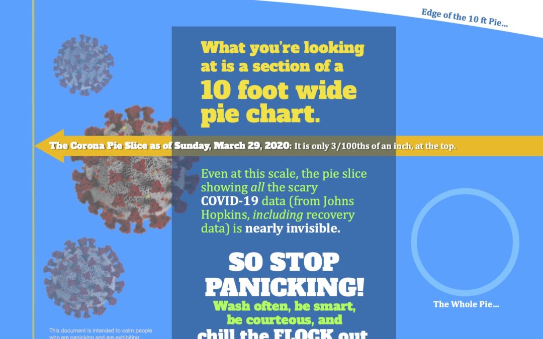
For this reason, Creative Coeur will be publishing a pie chart that puts the virus in perspective on a global scale. Our minds understand big numbers better when we can visualize them – fact. We hope that the context provided by our infographic can help ease your panic, as well as the fears of the people around you.
Feel free to share with whomever can benefit.

by creativecoeur | Mar 26, 2020 | Public Service
Social reaction to the virus has, in many cases been worse than the virus. This bug, as bad as it is, shouldn’t be threatening the fabric of life as we know it.
Certainly we should have been better prepared, but even so, the apocalyptic reaction by the public and our government officials (not a partisan statement – observation) has led people to hysteria and panic. This is generating a ripple effect, worsening the virus’s impact on our overall health, economy, and society as a whole. It is likely that we’ll suffer more from the unforeseen consequences of our collective fear than from the virus itself.
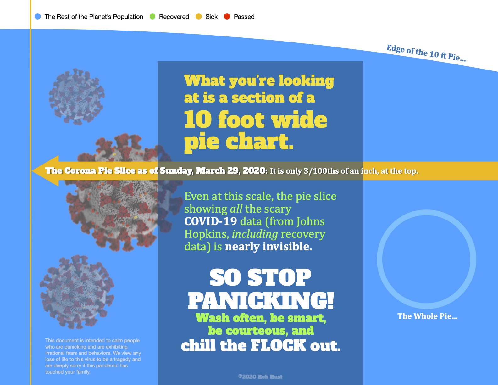
For this reason, Creative Coeur will be publishing a pie chart that puts the virus in perspective on a global scale. Our minds understand big numbers better when we can visualize them – fact. We hope that the context provided by our infographic can help ease your panic, as well as the fears of the people around you.
Feel free to share with whomever can benefit.

by creativecoeur | Mar 21, 2020 | Public Service
Social reaction to the virus has, in many cases been worse than the virus. This bug, as bad as it is, shouldn’t be threatening the fabric of life as we know it.
Certainly we should have been better prepared, but even so, the apocalyptic reaction by the public and our government officials (not a partisan statement – observation) has led people to hysteria and panic. This is generating a ripple effect, worsening the virus’s impact on our overall health, economy, and society as a whole. It is likely that we’ll suffer more from the unforeseen consequences of our collective fear than from the virus itself.
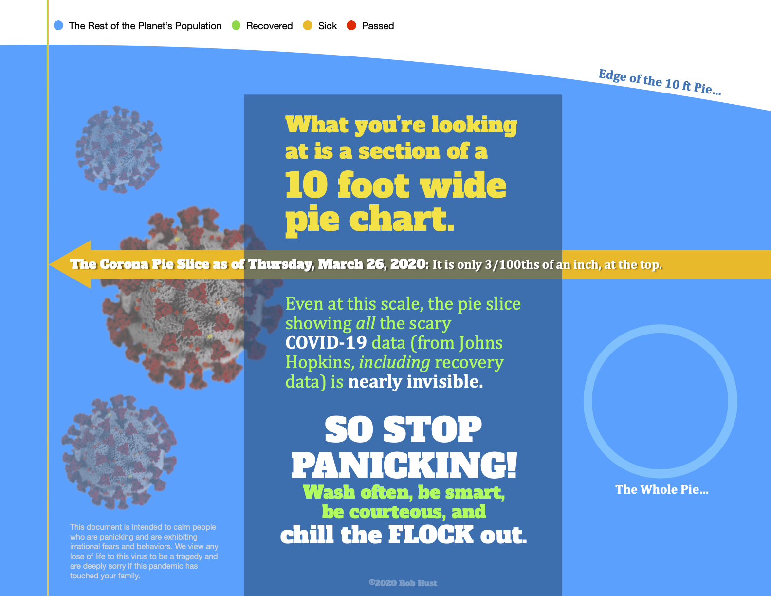
For this reason, Creative Coeur will be publishing a pie chart that puts the virus in perspective on a global scale. Our minds understand big numbers better when we can visualize them – fact. We hope that the context provided by our infographic can help ease your panic, as well as the fears of the people around you.
Feel free to share with whomever can benefit.
by creativecoeur | Mar 20, 2020 | Public Service
Social reaction to the virus has, in many cases been worse than the virus. This bug, as bad as it is, shouldn’t be threatening the fabric of life as we know it.
Certainly we should have been better prepared, but even so, the apocalyptic reaction by the public and our government officials (not a partisan statement – observation) has led people to hysteria and panic. This is generating a ripple effect, worsening the virus’s impact on our overall health, economy, and society as a whole. It is likely that we’ll suffer more from the unforeseen consequences of our collective fear than from the virus itself.
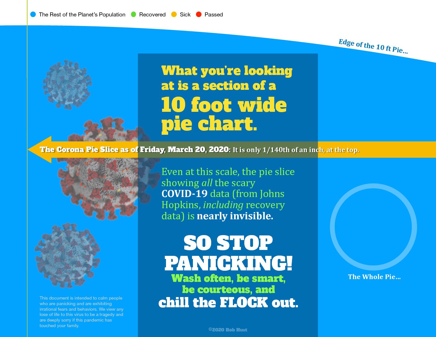
For this reason, Creative Coeur will be publishing a pie chart that puts the virus in perspective on a global scale. Our minds understand big numbers better when we can visualize them – fact. We hope that the context provided by our infographic can help ease your panic, as well as the fears of the people around you.
Feel free to share with whomever can benefit.

by creativecoeur | Mar 19, 2020 | Public Service
Social reaction to the virus has, in many cases been worse than the virus. This bug, as bad as it is, shouldn’t be threatening the fabric of life as we know it.
Certainly we should have been better prepared, but even so, the apocalyptic reaction by the public and our government officials (not a partisan statement – observation) has led people to hysteria and panic. This is generating a ripple effect, worsening the virus’s impact on our overall health, economy, and society as a whole. It is likely that we’ll suffer more from the unforeseen consequences of our collective fear than from the virus itself.
For this reason, Creative Coeur will be publishing a pie chart that puts the virus in perspective on a global scale. Our minds understand big numbers better when we can visualize them – fact. We hope that the context provided by our infographic can help ease your panic, as well as the fears of the people around you.
Feel free to share with whomever can benefit.
by creativecoeur | Mar 18, 2020 | Public Service
Social reaction to the virus has, in many cases been worse than the virus. This bug, as bad as it is, shouldn’t be threatening the fabric of life as we know it.
Certainly we should have been better prepared, but even so, the apocalyptic reaction by the public and our government officials (not a partisan statement – observation) has led people to hysteria and panic. This is generating a ripple effect, worsening the virus’s impact on our overall health, economy, and society as a whole. It is likely that we’ll suffer more from the unforeseen consequences of our collective fear than from the virus itself.
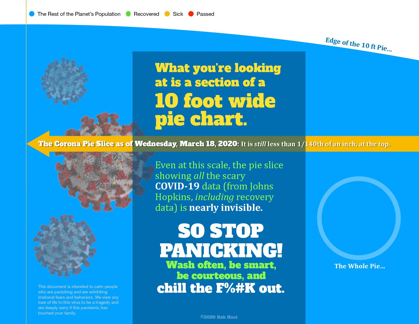
For this reason, Creative Coeur will be publishing a pie chart that puts the virus in perspective on a global scale. Our minds understand big numbers better when we can visualize them – fact. We hope that the context provided by or infographic can help ease your panic, as well as the fears of the people around you.
Feel free to share with whomever can benefit.


Recent Comments